樣式化模式
從各種預先樣式化的主題中選擇,或開發您自己的主題。
架構 #
PrimeVue 是一個與設計無關的函式庫,因此與其他一些 UI 函式庫不同,它不會強制使用特定的樣式,例如材質設計。樣式設定是透過主題而不是元件來分離的。一個主題包含兩個部分:基礎和預設。基礎是帶有 CSS 變數作為佔位符的樣式規則,而預設是一組設計標記,透過將標記對應到 CSS 變數來饋送基礎。一個基礎可以使用不同的預設進行配置,目前 Aura、Material、Lara 和 Nora 是可用的內建選項。
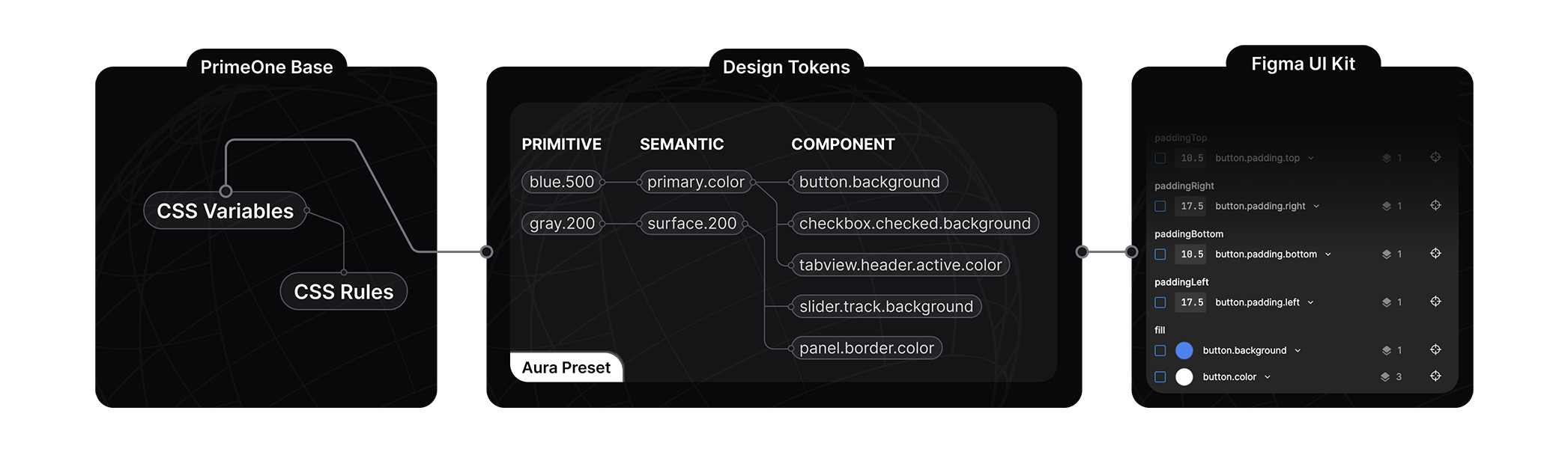
樣式化模式架構的核心基於一個名為設計標記的概念,預設在 3 個層級中定義標記配置:原始、語義和元件。
原始標記
原始標記沒有上下文,調色盤是原始標記的一個很好的例子,例如blue-50到blue-900。一個名為blue-500的標記可以用作主要顏色、訊息的背景,但就其本身而言,標記的名稱並不表示上下文。它們通常被語義標記使用。
語義標記
語義標記定義內容,其名稱表示它們在哪裡使用,一個眾所周知的語義標記示例是primary.color。語義標記會對應到原始標記或其他語義標記。colorScheme標記群組是一個特殊變數,用於根據應用程式中活動的顏色方案來定義標記,這允許根據顏色方案(如深色模式)定義不同的標記。
元件標記
元件標記是每個元件的獨立標記,例如inputtext.background或button.color,它們對應到語義標記。例如,button.background元件標記對應到primary.color語義標記,而該標記又對應到green.500原始標記。
最佳實踐
在定義核心調色盤時使用原始標記,並使用語義標記來指定常見的設計元素,例如焦點環、主要顏色和表面。元件標記僅應在自訂特定元件時使用。透過將您自己的設計標記定義為自訂預設,您將能夠在不觸及 CSS 的情況下定義自己的樣式。使用樣式類別覆寫 PrimeVue 元件並非最佳實踐,應作為最後手段,設計標記是建議的方法。
影片教學
觀看PrimeVue 主題設定揭秘系列,以透過範例了解更多關於架構的資訊。
組態 API #
主題 #
theme 屬性用於自訂初始主題。
import PrimeVue from 'primevue/config';
import Aura from '@primevue/themes/aura';

const app = createApp(App);

app.use(PrimeVue, {
    // Default theme configuration
    theme: {
        preset: Aura,
        options: {
            prefix: 'p',
            darkModeSelector: 'system',
            cssLayer: false
        }
    }
 });
選項 #
options 屬性定義了如何從預設的設計標記產生 CSS。
prefix
CSS 變數的前綴,預設為 p。例如,primary.color 設計標記會是 var(--p-primary-color)。
options: {
    prefix: 'my'
}
darkModeSelector
用於封裝深色模式 CSS 變數的 CSS 規則,預設為system以產生@media (prefers-color-scheme: dark)。如果您需要根據使用者選擇使深色模式可切換,請定義一個類別選擇器,例如 .app-dark,並在文件根目錄切換此類別。請參閱深色模式切換部分以取得範例。
options: {
    darkModeSelector: '.my-app-dark'
}
cssLayer
定義樣式是否應預設定義在 CSS 層中。CSS 層在必要時可以方便地聲明一個自訂層疊層,以便更輕鬆地進行自訂。預設值為 false。
options: {
    cssLayer: {
        name: 'primevue',
        order: 'app-styles, primevue, another-css-library'
    }
}
預設 #
Aura、Material、Lara 和 Nora 是可用的內建選項,旨在展示與設計無關的主題設定的強大功能。Aura 是 PrimeTek 自己的願景,Material 遵循 Google Material Design v2,Lara 基於 Bootstrap,而 Nora 的靈感來自企業應用程式。請造訪原始碼以了解更多關於預設結構的資訊。您可以直接使用它們並進行修改,或在需要從頭開始建構自己的預設時將它們作為參考。
大小寫樣式 #
標記以點分隔符號描述,例如 primary.color、form.field.background 或 checkbox.icon.checked.color。在預設配置中,在對應點分隔符號時會使用駝峰式大小寫和物件屬性。以下是來自核取方塊元件標記的範例,表示 checkbox.icon.checked.color,所有替代方案都具有相同的結果。
export default {
    iconCheckedColor: //...,
}

export default {
    icon: {
        checkedColor: //...
    }
}

export default {
    icon: {
        checked: {
            color: //...
        }
    }
}
保留的鍵 #
以下鍵在預設方案中保留,不能用作標記名稱:primitive、semantic、components、directives、colorscheme、light、dark、common、root、states 和 extend。
顏色 #
預設的調色盤是由 primitive 設計標記群組定義的。您可以使用 CSS 變數或 $dt 公用程式來存取顏色。
// With CSS
var(--p-blue-500)

// With JS
$dt('blue.500').value
- 祖母綠 (emerald)50100200300400500600700800900950
- 綠色 (green)50100200300400500600700800900950
- 萊姆 (lime)50100200300400500600700800900950
- 紅色 (red)50100200300400500600700800900950
- 橘色 (orange)50100200300400500600700800900950
- 琥珀色 (amber)50100200300400500600700800900950
- 黃色 (yellow)50100200300400500600700800900950
- 藍綠色 (teal)50100200300400500600700800900950
- 青色 (cyan)50100200300400500600700800900950
- 天空藍 (sky)50100200300400500600700800900950
- 藍色 (blue)50100200300400500600700800900950
- 靛藍色 (indigo)50100200300400500600700800900950
- 紫羅蘭色 (violet)50100200300400500600700800900950
- 紫色 (purple)50100200300400500600700800900950
- 紫紅色 (fuchsia)50100200300400500600700800900950
- 粉紅色 (pink)50100200300400500600700800900950
- 玫瑰色 (rose)50100200300400500600700800900950
- 板岩色 (slate)50100200300400500600700800900950
- 灰色 (gray)50100200300400500600700800900950
- 鋅色 (zinc)50100200300400500600700800900950
- 中性色 (neutral)50100200300400500600700800900950
- 石頭色 (stone)50100200300400500600700800900950
深色模式 #
PrimeVue 在主題配置中預設使用 system 作為 darkModeSelector。如果您的應用程式中有深色模式開關,請將 darkModeSelector 設定為您使用的選擇器(例如 .my-app-dark),以便 PrimeVue 可以與您的顏色方案無縫配合。
import PrimeVue from 'primevue/config';
import Aura from '@primevue/themes/aura';

const app = createApp(App);

app.use(PrimeVue, {
    // Default theme configuration
    theme: {
        preset: Aura,
        options: {
            darkModeSelector: '.my-app-dark',
        }
    }
 });
以下是一個非常基本的深色模式開關實作範例,您可以透過引入 prefers-color-scheme 從系統中初始擷取它,並使用 localStorage 使其具有狀態,進一步擴展它。請參閱這篇文章以取得更多資訊。
<Button label="Toggle Dark Mode" @click="toggleDarkMode()" />
function toggleDarkMode() {
    document.documentElement.classList.toggle('my-app-dark');
}
如果您喜歡一直使用深色模式,請初始套用 darkModeSelector,並且永遠不要變更它。
<html class="my-app-dark">
也可以使用 false 或 none 作為選擇器的值來完全停用深色模式。
theme: {
    preset: Aura,
    options: {
        darkModeSelector: false || 'none',
    }
}
自訂 #
definePreset #
definePreset 公用程式用於在 PrimeVue 設定期間自訂現有的預設。第一個參數是要自訂的預設,第二個參數是要覆寫的設計標記。
import PrimeVue from 'primevue/config';
import { definePreset } from '@primevue/themes';
import Aura from '@primevue/themes/aura';

const MyPreset = definePreset(Aura, {
    //Your customizations, see the following sections for examples
});

app.use(PrimeVue, {
    theme: {
        preset: MyPreset
    }
 });
主要 #
primary 定義主要調色盤,預設值對應到 emerald 原始標記。讓我們設定為改用 indigo。
const MyPreset = definePreset(Aura, {
    semantic: {
        primary: {
            50: '{indigo.50}',
            100: '{indigo.100}',
            200: '{indigo.200}',
            300: '{indigo.300}',
            400: '{indigo.400}',
            500: '{indigo.500}',
            600: '{indigo.600}',
            700: '{indigo.700}',
            800: '{indigo.800}',
            900: '{indigo.900}',
            950: '{indigo.950}'
        }
    }
});
表面 #
在淺色和深色模式之間變化的調色盤是用表面標記指定的。下面的範例在淺色模式下使用 zinc,在深色模式下使用 slategray。透過此設定,淺色模式將具有灰階色調,而深色模式將包含藍色調。
const MyPreset = definePreset(Aura, {
    semantic: {
        colorScheme: {
            light: {
                surface: {
                    0: '#ffffff',
                    50: '{zinc.50}',
                    100: '{zinc.100}',
                    200: '{zinc.200}',
                    300: '{zinc.300}',
                    400: '{zinc.400}',
                    500: '{zinc.500}',
                    600: '{zinc.600}',
                    700: '{zinc.700}',
                    800: '{zinc.800}',
                    900: '{zinc.900}',
                    950: '{zinc.950}'
                }
            },
            dark: {
                surface: {
                    0: '#ffffff',
                    50: '{slate.50}',
                    100: '{slate.100}',
                    200: '{slate.200}',
                    300: '{slate.300}',
                    400: '{slate.400}',
                    500: '{slate.500}',
                    600: '{slate.600}',
                    700: '{slate.700}',
                    800: '{slate.800}',
                    900: '{slate.900}',
                    950: '{slate.950}'
                }
            }
        }
    }
});
Noir #
noir 模式是一個變體的暱稱,它使用表面色調作為主要顏色,並且需要額外的 colorScheme 配置才能實作。一個以黑色和白色變體作為主要顏色的範例預設配置:
const Noir = definePreset(Aura, {
    semantic: {
        primary: {
            50: '{zinc.50}',
            100: '{zinc.100}',
            200: '{zinc.200}',
            300: '{zinc.300}',
            400: '{zinc.400}',
            500: '{zinc.500}',
            600: '{zinc.600}',
            700: '{zinc.700}',
            800: '{zinc.800}',
            900: '{zinc.900}',
            950: '{zinc.950}'
        },
        colorScheme: {
            light: {
                primary: {
                    color: '{zinc.950}',
                    inverseColor: '#ffffff',
                    hoverColor: '{zinc.900}',
                    activeColor: '{zinc.800}'
                },
                highlight: {
                    background: '{zinc.950}',
                    focusBackground: '{zinc.700}',
                    color: '#ffffff',
                    focusColor: '#ffffff'
                }
            },
            dark: {
                primary: {
                    color: '{zinc.50}',
                    inverseColor: '{zinc.950}',
                    hoverColor: '{zinc.100}',
                    activeColor: '{zinc.200}'
                },
                highlight: {
                    background: 'rgba(250, 250, 250, .16)',
                    focusBackground: 'rgba(250, 250, 250, .24)',
                    color: 'rgba(255,255,255,.87)',
                    focusColor: 'rgba(255,255,255,.87)'
                }
            }
        }
    }
});
字型 #
UI 元件的字型設定繼承自應用程式,因此沒有針對字型的設計。
表單 #
表單輸入元件的設計令牌 (design tokens) 源自於 form.field 令牌群組。此自訂範例將滑鼠懸停時的邊框顏色變更為主要顏色。任何依賴此語意令牌的元件,例如 dropdown.hover.border.color 和 textarea.hover.border.color 都會收到變更。
const MyPreset = definePreset(Aura, {
    semantic: {
        colorScheme: {
            light: {
                formField: {
                    hoverBorderColor: '{primary.color}'
                }
            },
            dark: {
                formField: {
                    hoverBorderColor: '{primary.color}'
                }
            }
        }
    }
});
焦點環 #
焦點環定義了外框的寬度、樣式、顏色和偏移量。讓我們使用主要顏色作為外框,並加粗環的寬度。
const MyPreset = definePreset(Aura, {
    semantic: {
        focusRing: {
            width: '2px',
            style: 'dashed',
            color: '{primary.color}',
            offset: '1px'
        }
    }
});
元件 #
特定元件的設計令牌定義在 components 層。如果您要建立自己的樣式,不建議覆寫元件令牌,而應優先建立自己的預設設定。此設定是全域的,並適用於所有卡片元件。如果您需要在頁面上局部自訂特定元件,請查看「範圍 CSS」章節中的範例。
const MyPreset = definePreset(Aura, {
    components: {
        card: {
            colorScheme: {
                light: {
                    root: {
                        background: '{surface.0}',
                        color: '{surface.700}'
                    },
                    subtitle: {
                        color: '{surface.500}'
                    }
                },
                dark: {
                    root: {
                        background: '{surface.900}',
                        color: '{surface.0}'
                    },
                    subtitle: {
                        color: '{surface.400}'
                    }
                }
            }
        }
    }
});
擴展 #
主題系統可以透過加入自訂設計令牌和其他樣式來擴展。此功能提供了高度的自訂性,讓您可以根據自己的需求調整樣式,而不受限於預設令牌。
範例預設設定新增了一個新的 accent 按鈕,其中包含自訂的 button.accent.color 和 button.accent.inverse.color 令牌。也可以全域新增令牌,以便在元件之間共用。
const MyPreset = definePreset(Aura, {
    components: {
        // custom button tokens and additional style
        button: {
            extend: {
                accent: {
                    color: '#f59e0b',
                    inverseColor: '#ffffff'
                }
            }
        css: ({ dt }) => `
.p-button-accent {
    background: ${dt('button.accent.color')};
    color: ${dt('button.accent.inverse.color')};
    transition-duration: ${dt('my.transition.fast')};
}
`
        }
    },
    // common tokens and styles
    extend: {
        my: {
            transition: {
                slow: '0.75s'
                normal: '0.5s'
                fast: '0.25s'
            },
            imageDisplay: 'block'
        }
    },
    css: ({ dt }) => `
        /* Global CSS */
        img {
            display: ${dt('my.image.display')};
        }
    `
});
範圍令牌 #
可以使用 dt 屬性將設計令牌的範圍限定於特定元件。在此範例中,第一個開關使用全域令牌,而第二個開關則使用自己的令牌覆寫全域令牌。
相較於 :deep(),建議使用此方法,因為它提供了更簡潔的 API,同時避免了覆寫 CSS 規則的麻煩。
<template>
    <div>
        <ToggleSwitch v-model="checked1" />
        <ToggleSwitch v-model="checked2" :dt="amberSwitch" />
    </div>
</template>

<script setup>
import { ref } from 'vue';

const checked1 = ref(true);
const checked2 = ref(true);
const amberSwitch = ref({
    handle: {
        borderRadius: '4px'
    },
    colorScheme: {
        light: {
            root: {
                checkedBackground: '{amber.500}',
                checkedHoverBackground: '{amber.600}',
                borderRadius: '4px'
            },
            handle: {
                checkedBackground: '{amber.50}',
                checkedHoverBackground: '{amber.100}'
            }
        },
        dark: {
            root: {
                checkedBackground: '{amber.400}',
                checkedHoverBackground: '{amber.300}',
                borderRadius: '4px'
            },
            handle: {
                checkedBackground: '{amber.900}',
                checkedHoverBackground: '{amber.800}'
            }
        }
    }
});
</script>
工具 #
usePreset #
完全取代目前的預設設定,常見的用例是在執行期間動態變更預設設定。
import { usePreset } from '@primevue/themes';

const onButtonClick() {
    usePreset(MyPreset);
}
updatePreset #
將提供的令牌合併到目前的預設設定中,例如動態變更主要調色盤。
import { updatePreset } from '@primevue/themes';

const changePrimaryColor() {
    updatePreset({
        semantic: {
            primary: {
                50: '{indigo.50}',
                100: '{indigo.100}',
                200: '{indigo.200}',
                300: '{indigo.300}',
                400: '{indigo.400}',
                500: '{indigo.500}',
                600: '{indigo.600}',
                700: '{indigo.700}',
                800: '{indigo.800}',
                900: '{indigo.900}',
                950: '{indigo.950}'
            }
        }
    })
}
updatePrimaryPalette #
更新主要顏色,這是使用 updatePreset 進行相同更新的簡寫。
import { updatePrimaryPalette } from '@primevue/themes';

const changePrimaryColor() {
    updatePrimaryPalette({
        50: '{indigo.50}',
        100: '{indigo.100}',
        200: '{indigo.200}',
        300: '{indigo.300}',
        400: '{indigo.400}',
        500: '{indigo.500}',
        600: '{indigo.600}',
        700: '{indigo.700}',
        800: '{indigo.800}',
        900: '{indigo.900}',
        950: '{indigo.950}'
    });
}
updateSurfacePalette #
更新表面顏色,這是使用 updatePreset 進行相同更新的簡寫。
import { updateSurfacePalette } from '@primevue/themes';

const changeSurfaces() {
    //changes surfaces both in light and dark mode
    updateSurfacePalette({
        50: '{zinc.50}',
        // ...
        950: '{zinc.950}'
    });
}

const changeLightSurfaces() {
    //changes surfaces only in light
    updateSurfacePalette({
        light: {
            50: '{zinc.50}',
            // ...
            950: '{zinc.950}'
        }
    });
}

const changeDarkSurfaces() {
    //changes surfaces only in dark mode
    updateSurfacePalette({
        dark: {
            50: '{zinc.50}',
            // ...
            950: '{zinc.950}'
        }
    });
}
$dt #
$dt 函數會傳回有關令牌的資訊,例如完整路徑和值。如果您需要以程式方式存取令牌,這將非常有用。
import { $dt } from '@primevue/themes';

const duration = $dt('transition.duration');
/*
    duration: {
        name: '--transition-duration',
        variable: 'var(--p-transition-duration)',
        value: '0.2s'
    }
*/

const primaryColor = $dt('primary.color');
/*
    primaryColor: {
        name: '--primary-color',
        variable: 'var(--p-primary-color)',
        value: {
        light: {
            value: '#10b981',
            paths: {
                name: 'semantic.primary.color',
                binding: {
                    name: 'primitive.emerald.500'
                }
            }
        },
        dark: {
            value: '#34d399',
            paths: {
                name: 'semantic.primary.color',
                binding: {
                    name: 'primitive.emerald.400'
                }
            }
        }
    }
}
*/
palette #
以物件形式傳回指定顏色的 50 到 950 之間的色調和淡化色。
import { palette } from '@primevue/themes';

// custom color
const values1 = palette('#10b981');

// copy an existing token set
const primaryColor = palette('{blue}');
CSS 層 #
只有在主題配置中明確啟用分層時,PrimeVue CSS 層才適用於樣式模式。在無樣式模式下,不會包含內建的 CSS 類別,因此不需要任何層。
優先性 #
@layer 是標準的 CSS 功能,用於定義級聯層,以實現可自訂的優先順序。如果您需要更熟悉圖層,請訪問 MDN 的文件開始學習。
cssLayer 預設為停用,當在主題設定中啟用時,PrimeVue 會將內建的樣式類別包裝在 primevue 級聯層下,以便輕鬆覆寫程式庫樣式。應用程式中沒有圖層的 CSS 具有最高的 CSS 優先性,因此無論位置或類別的編寫強度如何,您都可以覆寫樣式。
圖層還能讓 CSS Modules 更容易使用,請查看 CSS Modules 指南以取得範例。
重置 #
如果 PrimeVue 元件在您的應用程式中出現視覺問題,則可能是 Reset CSS 所導致。CSS 圖層是一種有效的解決方案,包括啟用 PrimeVue 圖層、將 Reset CSS 包裝在另一個圖層中,並定義圖層順序。這樣,您的 Reset CSS 就不會影響 PrimeVue 元件。
/* Order */
@layer reset, primevue;

/* Reset CSS */
@layer reset {
    button,
    input {
        /* CSS to Reset */
    }
}
CSS Modules #
透過在 SFC 中的樣式元素上啟用 module 屬性,可以支援 CSS modules。使用 $style 關鍵字將類別套用至 PrimeVue 元件。建議在使用 CSS modules 時啟用 cssLayer,以便 PrimeVue 樣式具有較低的 CSS 優先性。
<style module>
.myinput {
    border-radius: 2rem;
    padding: 1rem 2rem;
    border-width: 2px;
}
</style>
<template>
    <InputText :class="$style.myinput" placeholder="Search" />
</template>
縮放 #
PrimeVue UI 元件使用 rem 單位,1rem 等於 html 元素的字型大小,預設值為 16px。使用根字型大小來全域調整元件的大小。此網站使用 14px 作為基礎,因此如果您的基礎字型大小不同,它可能會與您的應用程式不同。
html {
    font-size: 14px;
}